

Before You Start
- Currently limited to Super Administrators, traditionally reserved for Worlds employees who help set up and configure your environment. Worlds is working to open this up, both to more end-user roles and to deeper integration with Iris. If you or your team want to build custom dashboards - please let us know.
- The Custom Widgets tab covered near the end of this guide is feature-flagged and may not be enabled in every environment.
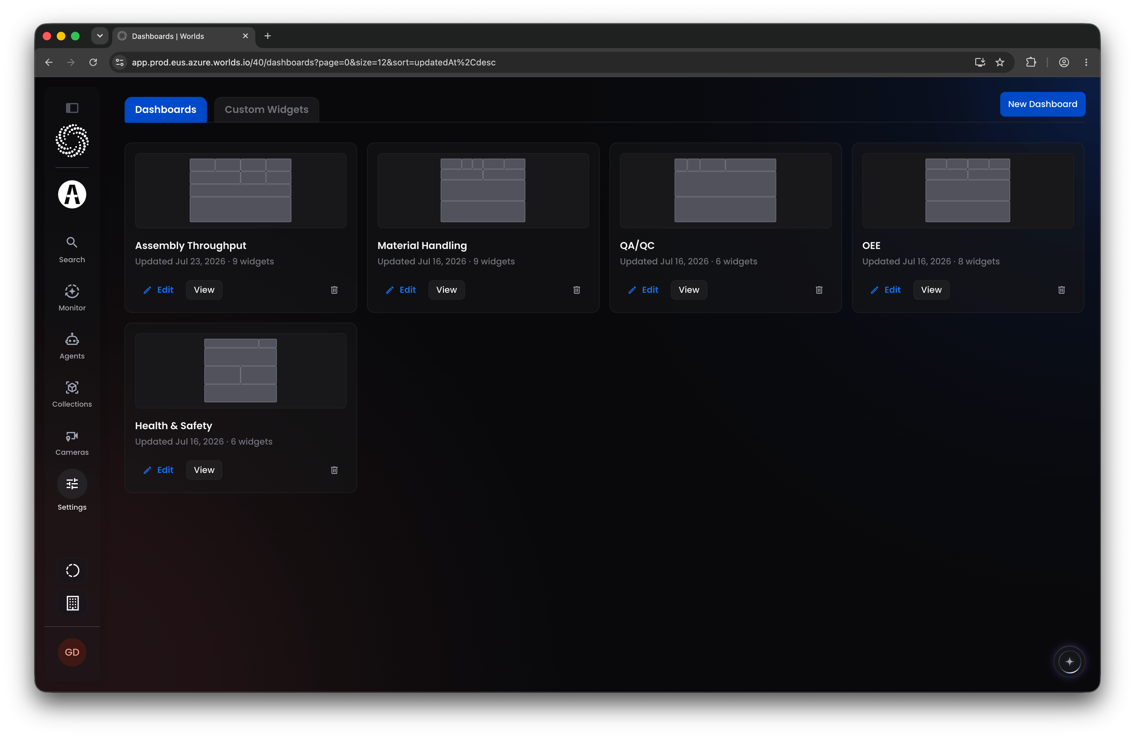
Step 1: Create a New Dashboard
Click New Dashboard in the top right and give it a name, then choose a layout. Tip: The layout is just a starting point, not a commitment. Large-format layouts suit a dashboard destined for a TV or big display; more focused layouts suit something reviewed on a monitor. Either way, everything is editable once you’re in the canvas, so the initial choice isn’t a big decision.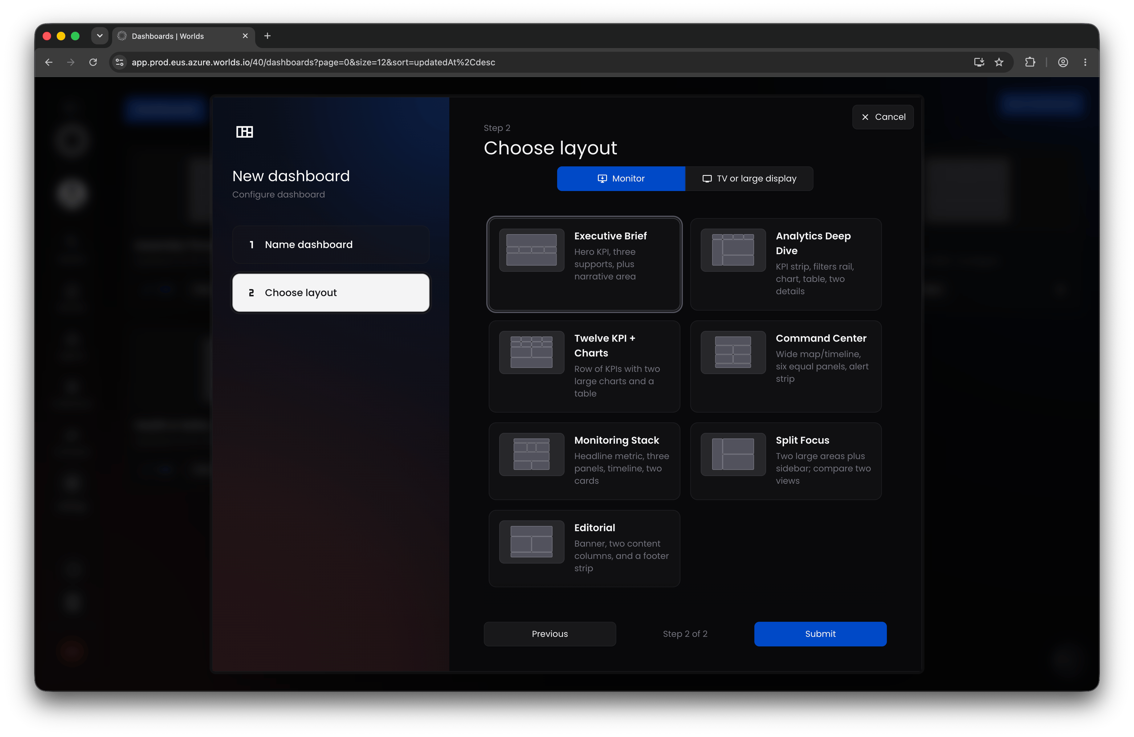
Step 2: Manipulate Your Canvas
Your layout choice loads as a set of blank spaces. Click and drag the bottom corner of any space to resize it: leaving negative space fills in the smallest available widget size, or drag a space larger to expand it and absorb whatever’s behind it.Step 3: Choose a Widget Type
Click the plus icon in any empty space to open the widget editor. “Widget” is the general term for any data visualization on a dashboard. Widgets are organized by category:- Monitor Volume - currently just Total Count
- Monitor Trends - time-based visualizations: a line graph (count over time), an area graph (same, with the area beneath filled in), and a bar graph (counts bucketed into time ranges)
- Compare Categories - comparative visualizations: horizontal ranked bar chart, ranked column chart, connected counts (a line graph without time on the x-axis), filled counts (line graph with the area filled in), and radial counts (distinct from a pie chart, the largest value fills the complete circle, useful for the same kind of comparison a bar or column chart would show)
- Understand Distribution - a standard pie/donut distribution chart, a tree map (sizes categories as proportional spaces), and the Active Hours heat map (hour of day by day of week, for any event metric)
- Analyze Location - the Events Map widget, plotting events on a map, colored by whatever dimension or category you choose. Note: requires calibrated cameras with GPS position data attached to events by the workflow, the same requirement as the Events Map on Event Intelligence.
- Inspect Details - a ranked list widget, similar to the bottom list on Event Intelligence, except it counts by category rather than pulling in specific events.
- Custom Widgets - any widget you’ve built with the custom code editor (see below) shows up here.
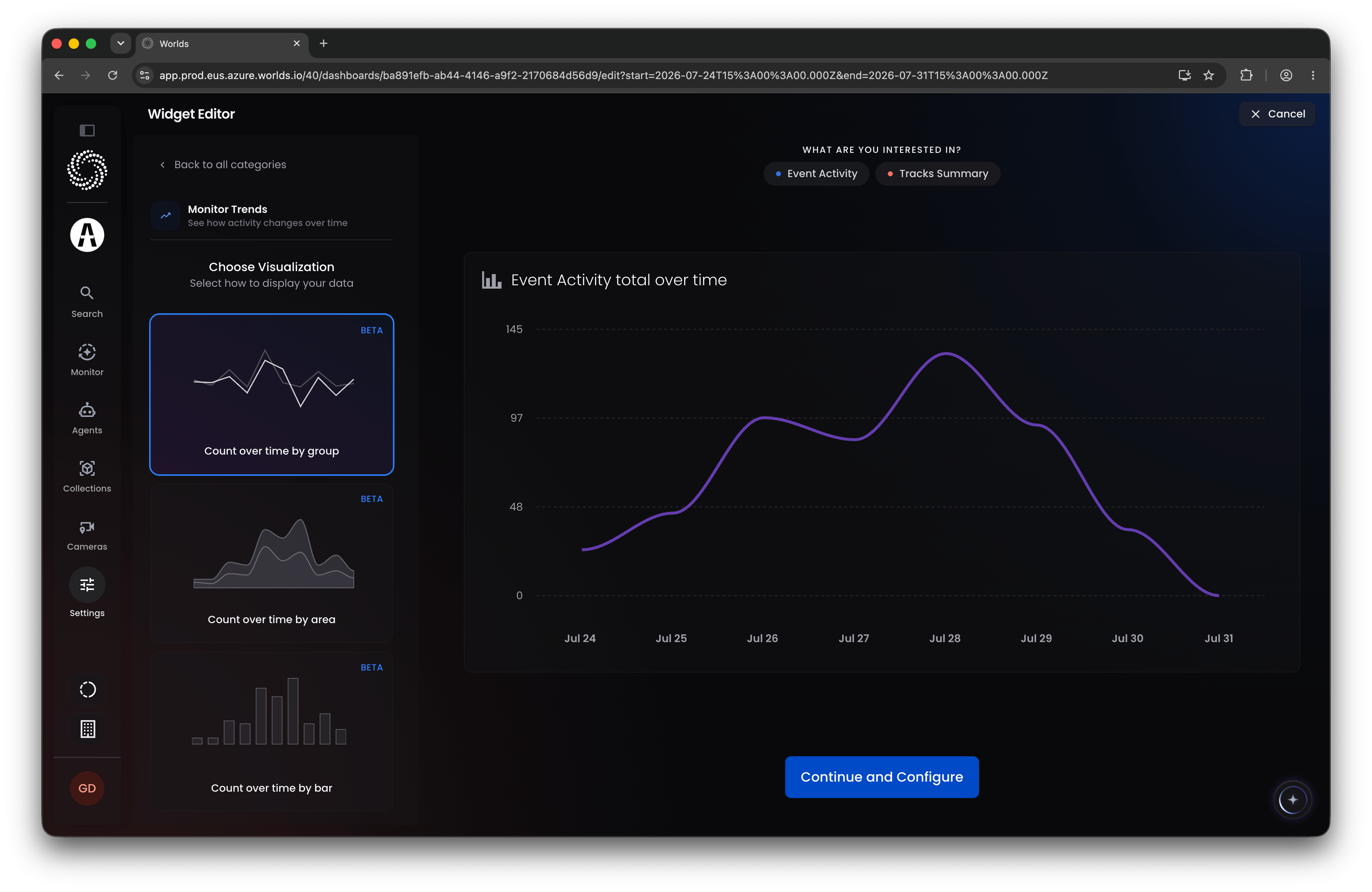
Step 4: Choose a Data Source
The labels at the top of the widget present options for compatible data sources. Many widgets only offer Event Activity as a data source, since visualizing the output of your workflows is the primary use case. Some widgets, like Total Count, can also pull from Tracks (individual detections by tracked position), Zones, or Devices (cameras). Select a data source, then click Continue to configure it.Step 5 (Optional): Add to a Section
You can also add a widget to a top or bottom section within the same space, useful for grouping visualizations that share the same filters, for example, pairing total event counts by priority with a line chart of the same events over time.Step 6: Configure the Widget
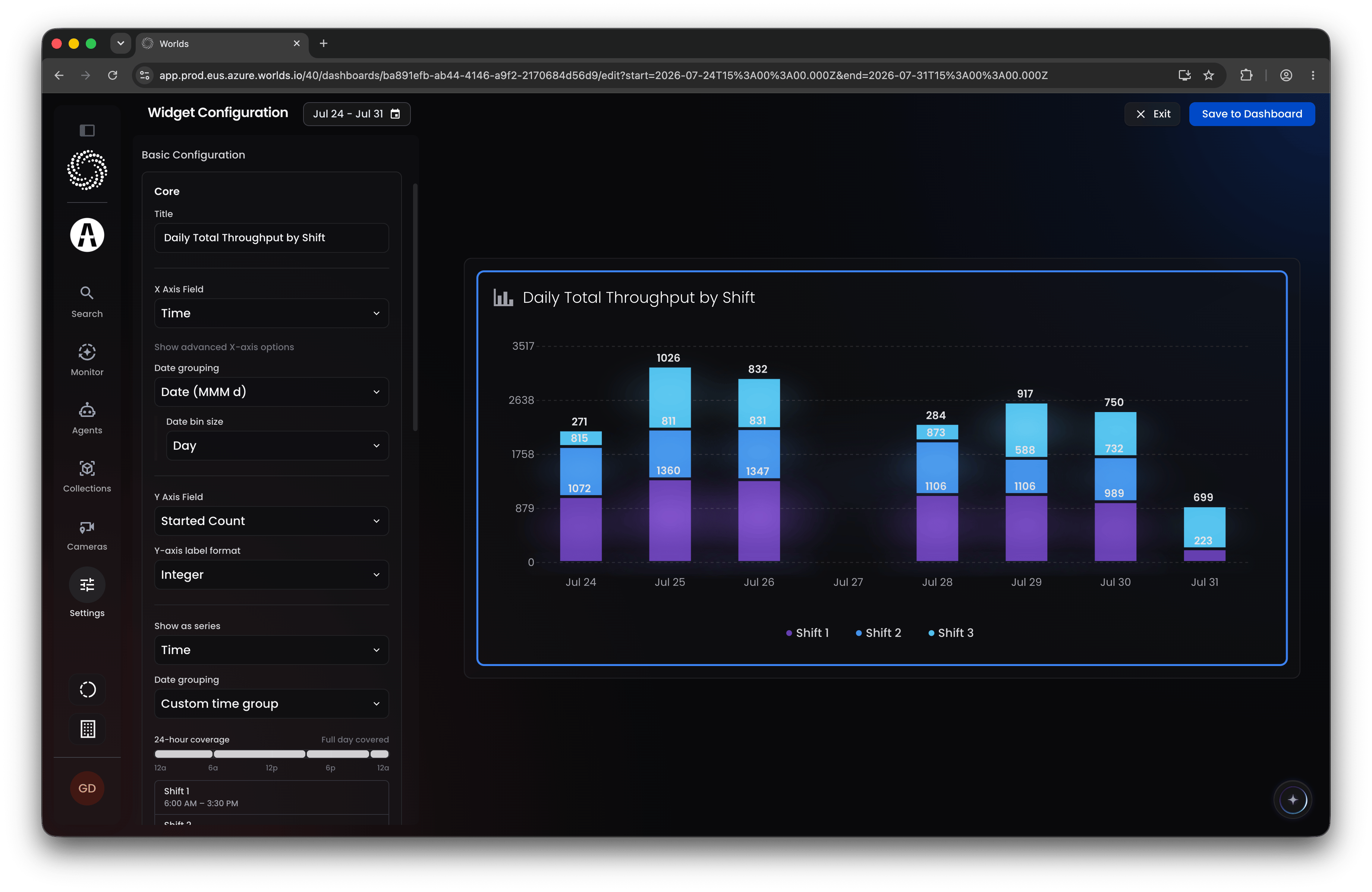
Clicking a widget opens its configuration panel on the left, with a live preview using the time range in the top left (the same way it’ll behave once published). There are three tabs:Core Data
Apply filters and sorts so the widget only pulls the data you actually want. You can filter by event/activity name, associated camera, priority, site, agent, or any metadata key-value pair, and add sort steps if the order matters.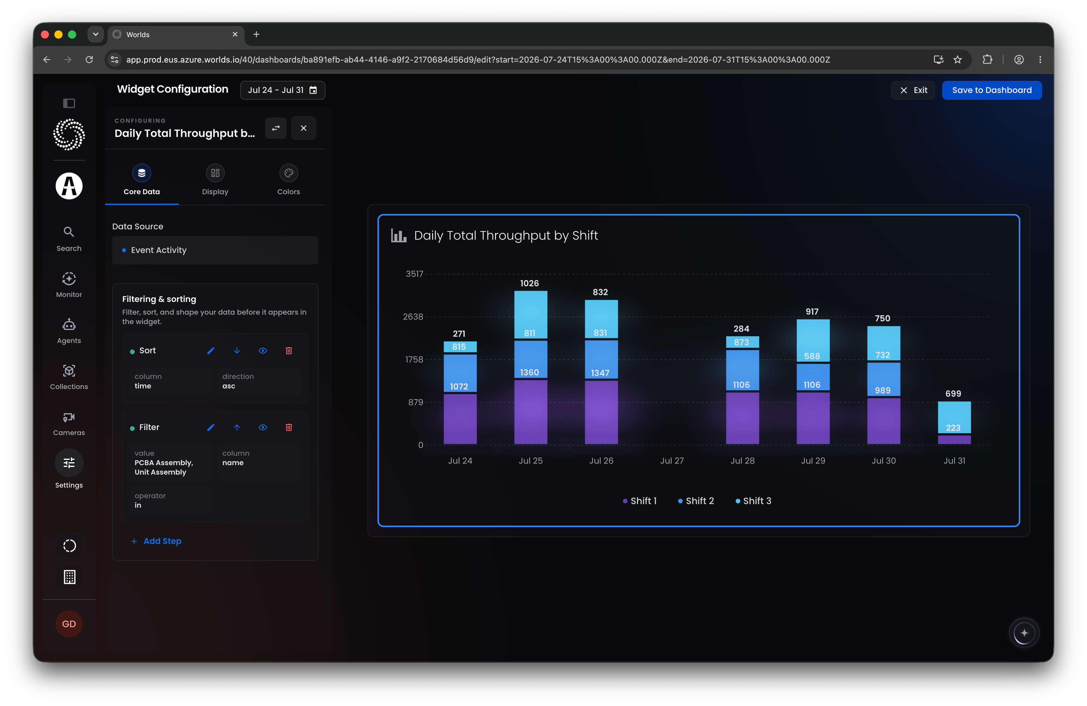
Display
Most of the configuration lives here.- Title - give the widget a clear, informative name other users will understand at a glance (“Safety Events Over Time,” “Hourly Forklift Events”).
- Axis fields - typically an X-axis, Y-axis, and an optional series. For a line chart, X is usually time (though it can be any dimension). Selecting time gives you a choice between continuous time (as a date, the default) or categorical time (by day of week or hour of day across your whole range).
- Bin size - if you keep continuous/date grouping, bin size controls granularity: day gives you one point per day, hour gives you one per hour, and so on. Set it to match the level of insight you’re after.
- Label format - depending on the field, format the display as a raw number, integer, decimal, compact style (1K, 1M), duration, or percentage.
- Series - most widgets (aside from simple ones like Total Count or Pie/Donut) let you split data by a category, for example, event volume split by priority, or by any metadata field. Very flexible.
- Custom grouping - available under most axis and series fields via “Add Custom Grouping.” Lets you bin several raw values into one relabeled group, for example, combining truck, car, semi-truck, jeep, trailer, and motorcycle tags into a single “Vehicles” category.
- Tooltip - toggle on and add explanatory text; any user hovering over the widget will see it. Good practice for anything that isn’t self-explanatory.
- Display options - show/hide gridlines, legend, axis labels, title, data markers, or data labels. Some of these expand into further formatting choices once enabled.
- Advanced settings - usually fine at the default, but worth adjusting if you’re displaying large volumes of data, since the number of series or data points shown can be capped by default. Also where you control whether null values are passed through or grouped into an “Unknown” category.
Colors
Set the widget’s color palette from a dropdown of preset palettes, or choose a single color for the whole series. Below that, the color filters menu lets you target specific values: select the series name, use “equal to” (or “in list” for multiple values) to target it, choose a color, and click Save. Useful for keeping meaning consistent across a dashboard, for example, always showing “QA Passed” or “Approved” in green and “QA Failed” or “Denied” in red across every widget.Step 7: Save and Keep Building
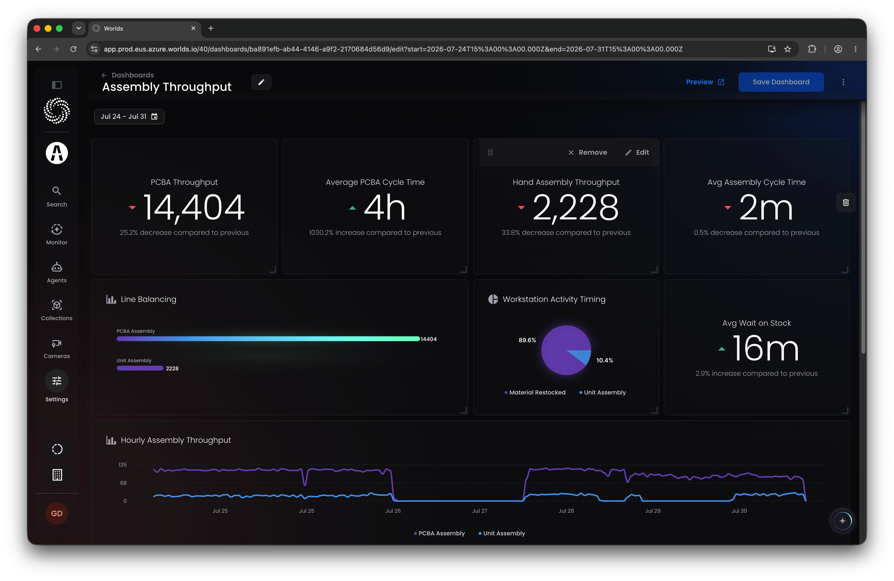
Click Save to Dashboard in the top right to return to the canvas with your widget placed. From there:- Add more widgets via the plus icons
- Edit or delete existing widgets
- Click and drag from the top to move, or from the bottom-right to resize existing widgets
- Click Add Row at the bottom for more space
Step 8: Publish
Saving a dashboard publishes it immediately, it becomes available to every user in the org on the Published Dashboards page under Monitoring.Custom Widgets (Code Editor)
Back on the root Dashboard Management page, the Custom Widgets tab (if enabled) lists any custom widgets already built in your environment, or an empty page with a New Widget button if none exist yet.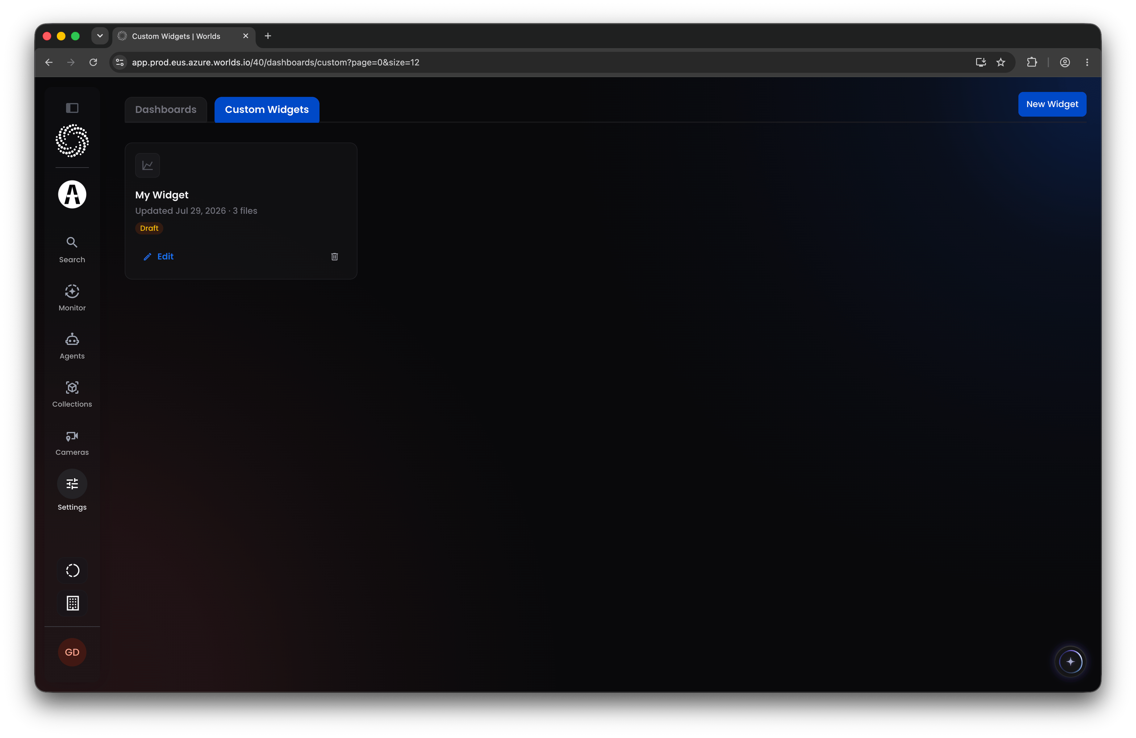
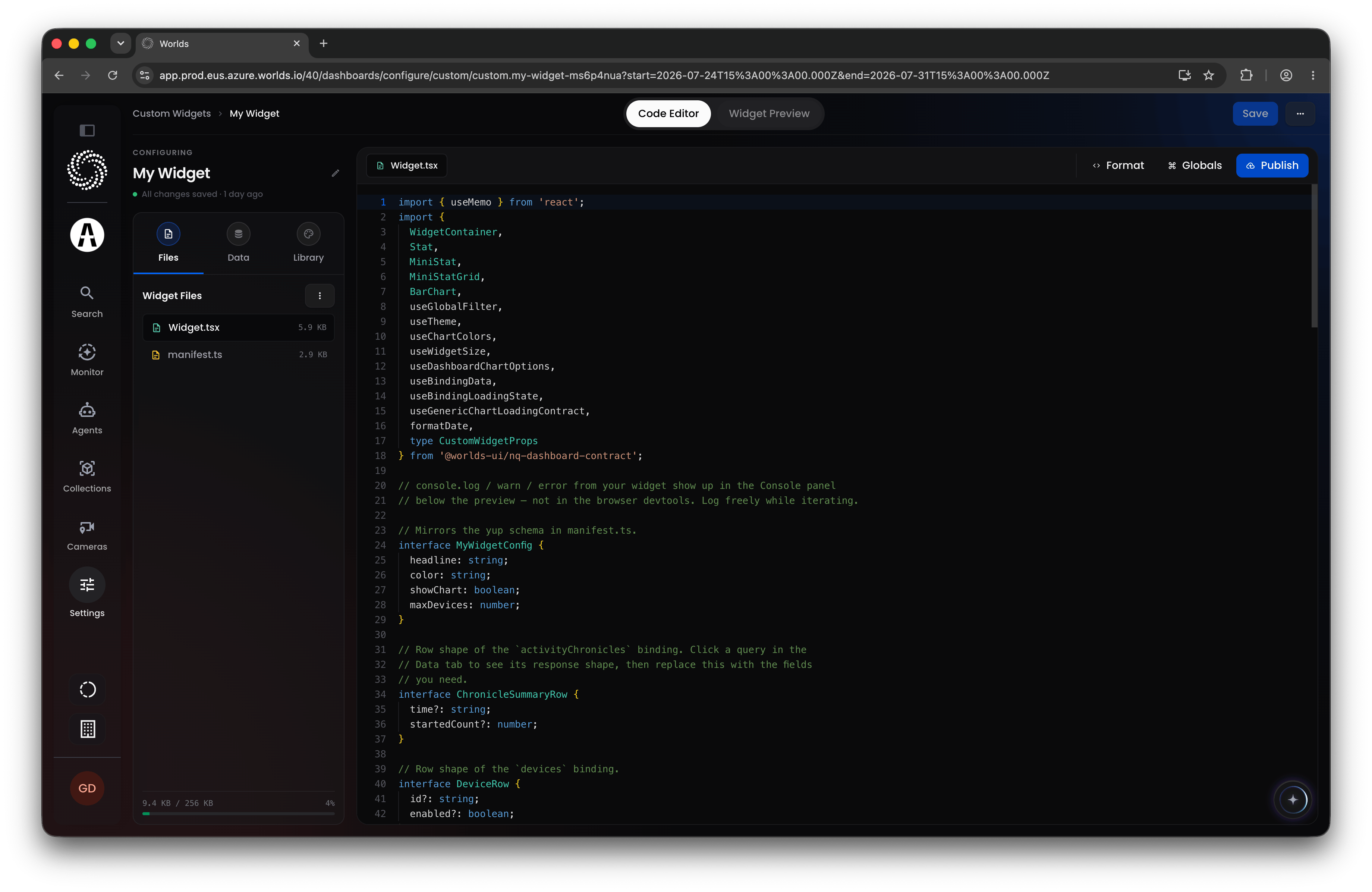
- The first page shows templated starter code for the widget, with a tab to render a live preview.
- The left panel lists the files the widget needs, with options to download, import, or add files. Download and edit locally in your own editor (matching the existing format), or use an AI coding assistant with these files as context to build the visualization you’re after, then re-upload.
- The Data tab lists the bindings used in the widget.
- The Library tab lists available UI library objects you can incorporate.
Quick Reference
- Access - Super Administrator only today; Worlds can grant access or build dashboards on your behalf
- New Dashboard - name it, pick a starting layout (fully editable afterward)
- Widget categories - Monitor Volume, Monitor Trends, Compare Categories, Understand Distribution, Analyze Location, Inspect Details, Custom Widgets
- Widget config tabs - Core Data (filter/sort), Display (title, axes, binning, series, grouping, tooltip, display toggles), Colors (palette and targeted color rules)
- Publishing - saving a dashboard makes it live immediately on Published Dashboards
- Custom Widgets tab - feature-flagged; built-in code editor with file management, data bindings, and a UI component library